by: Tracey P. Lauriault
I attended the European Regional Meeting of the Open Government Partnership at the Dublin Castle Conference Centre in May of this year. The meeting was a place for performance and evaluation wonks to show their wares, especially at the following sessions: Open Government Standards and Indicators for Measuring Progress, The EU’s Role in Promoting Transparency and Accountability and Engagement with the OGP, and Open Contracting: Towards a New Global Norm. I did not attend the Independent Reporting Mechanism (IRM) sessions, but having read the IRM report for Canada, I know that it too is an emerging performance evaluation indicator space, which is affirmed by a cursory examination of the IRMs two major databases. The most promising, yet the most disappointing session was the Economic Impact of Open Data session. This is unfortunate as there are now a number of models by which the values of sharing, disseminating and curating data have been measured. It would have been great to have heard either a critical analysis or a review of the newly released Ordinance Survey of Ireland report, Assessment of the Economic Value of the Geospatial Information Industry in Ireland, the many economic impact models listed here in the World Bank Toolkit, or the often cited McKinsey Global Institute Open data: Unlocking innovation and performance with liquid information report. Oh Well!
While there I was struck by the number of times maps were displayed. The mapping of public policy issues related to openness seems to have become a normalized communication method to show how countries fare according to a number of indicators that aim to measure how transparent, prone to corruption, engagemed civil society is, or how open in terms of data, open in terms of information, and open in terms of government nation states are.
What the maps show is how jurisdictionally bound up policy, law and regulatory matters concerning data are. The maps reveal how techno-political processes are sociospatial practices and how these sociospatial matters are delineated by territorial boundaries. What is less obvious, are the narratives about how the particularities of the spatial relations within these territories shape how the same policies, laws and regulation are differentially enacted.
Below are 10 world maps which depict a wide range of indicators and sub-indicators, indices, scorecards, and standards. Some simply show if a country is a member of an institution or is a signatory to an international agreement. Most are interactive except for one, they all provide links to reports and methodologies, some more extensive than others. Some of the maps are a call to action; others are created to solicit input from the crowd, while most are created to demonstrate how countries fare against each other according to their schemes. One map is a discovery map to a large number of indicators found in an indicator portal while another shows the breadth of civil society participation. These maps are created in a variety of customized systems while three rely on third party platforms such as Google Maps or Open Street Maps. They are published by a variety of organizations such as transnational institutions, well resourced think tanks or civil society organizations.
We do not know the impact these maps have on the minds of the decision makers for whom they are aimed, but I do know that these are often shown as backdrops to discussions at international meetings such as the OGP to make a point about who is and is not in an open and transparent club. They are therefore political tools, used to do discursive work. They do not simply represent the open data landscape, but actively help (re)produce it. As such, they demand further scrutiny as to the data assemblage surrounding them (amalgams of systems of thought, forms of knowledge, finance, political economies, governmentalities and legalities, materialities and infrastructures, practices, organisations and institutions, subjectivities and communities, places, and marketplaces), the instrumental rationality underpinning them, and the power/knowledge exercised through them.
This is work that we are presently conducting on the Programmable City project, which will complement a critical study concerning city data, indicators, benchmarking and dashboards, and we’ll return to them in future blog posts.
1. The Transparency International Corruption by Country / Territory Map
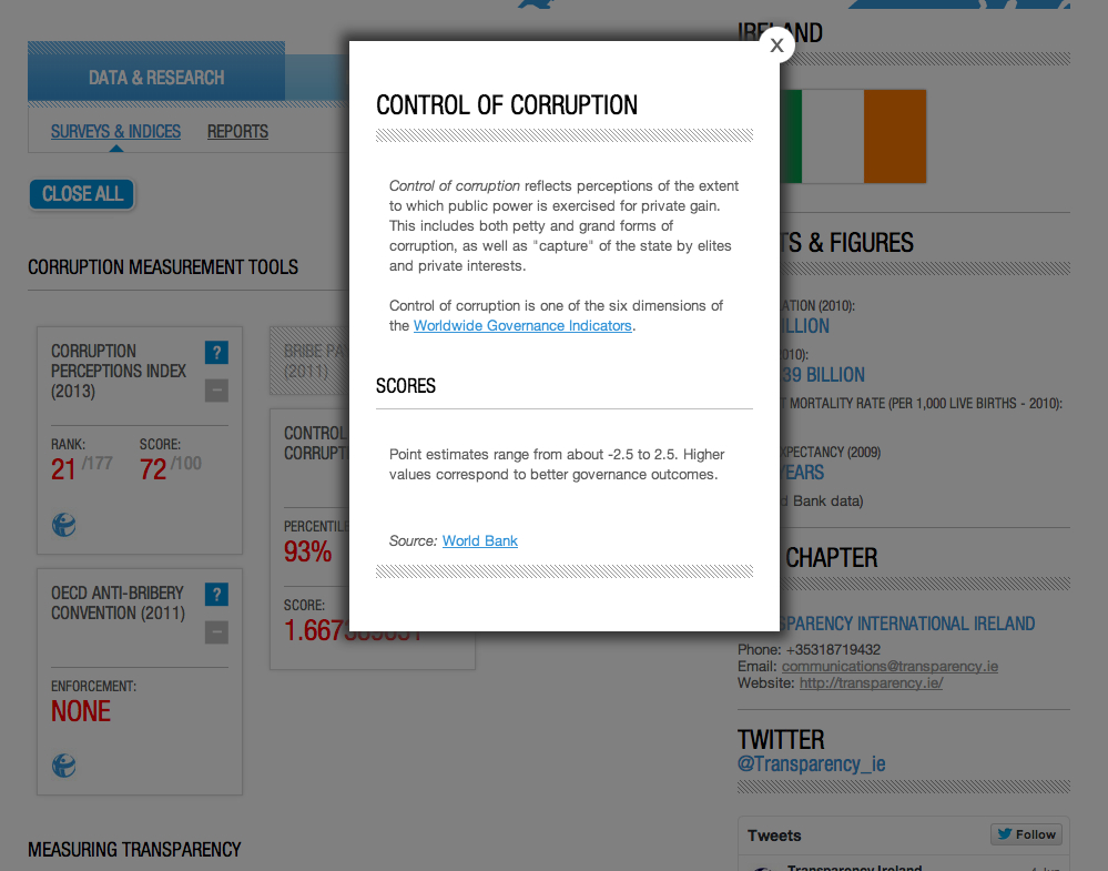
Users land on a blank blue world map of countries delineated by a thick white line, from which they select a country of interest. Once selected a series of indicators and indices such as the ‘Corruption measurement tools’, ‘Measuring transparency’ and ‘Other governance and development indicators’ appear. These are measured according rankings to a given n, scored as a percentage and whether or not the country is a signatory to a convention and if it is enforced. The numbers are derived from national statistics and surveys. The indicators are:
- Corruption Perceptions Index (2013), Transparency International
- Control of Corruption (2010), World Bank dimension of Worldwide Governance Indicators
- The Bribe Payer’s Index (2011), Transparency International
- Global Corruption Barometer (2013), Transparency International
- OECD Anti-Bribery Convention (2011)
- Financial Secrecy Index (2011), Tax Justice Network
- Open Budget Index (2010), International Budget Partnership
- Global Competitiveness Index (2012-2013), World Economic Forum Global Competitiveness Index
- Judicial Independence (2011-2012), World Economic Forum Global Competitiveness Index
- Human Development Index (2011), United Nations
- Rule of Law (2010), World Bank dimension of Worldwide Governance Indicators
- Press Freedom Index (2011-2012) Reporters Without Borders
- Voice & Accountability (2010), World Bank dimension of Worldwide Governance Indicators
By clicking on the question mark beside the indicators, a pop up window with some basic metadata appears. The window describes what is being measured and points to its source.
The page includes links to related reports, and a comments section where numerous and colourful opinions are provided!
Users land on a Google Map API mashup of Government, Citizen and Private Open Government initiatives. They are given the option to zoom in to see local initiatives. In this case, users are led to a typology of initiatives which define what Open Government means from civil society’s point of view.
Initiatives are classified with respect to the following categories 1) Transparency, 2) Participation and 3) Accountability. The development of the Open Government Standards are being coordinated by “Access Info Europe, a human rights organisation dedicated to the promotion and protection of the right of access to information in Europe and the defence of civil liberties and human rights with the aim of facilitating public participation in the decision-making process and demanding responsibility from governments”.
Definitions, parameters and criteria for a number of sub-indicators are being crowsourced in the online forms like the following for Openness:
The following is a list of standards that are a currently under development.
- Recognition of the Right to Know
- Openness
- Codes of Conduct: Clear standards of behaviour
- All information available from all public bodies
- Clear and reasonable Timelines
- Conflict of Interest Prevention Mechanisms
- Access is the Rule – Secrecy is the Exception
- Clear and comprehensive information
- Assets Disclosure
- Proactive Publication of Information
- Active collaboration
- Transparency and Regulation of Lobbying
- Free of charge and free for reuse
- Appropriate and Clear Procedures
- Whistleblower mechanisms and protections
- Open Formats
- Empowerment
- Procurement Transparency
- Compilation of information
- Transparency and Accountability
- Independent Enforcement Bodies
- Independent review mechanism
3. The Global Integrity Report Map
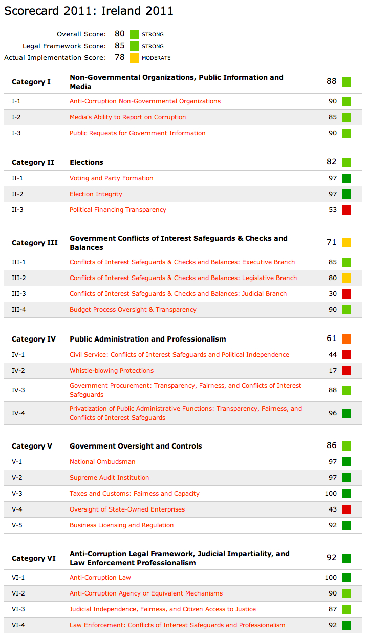
This is an interactive Open Street Map (OSM) Mapbox map depicting the locations where there is Global Integrity fieldwork national reports arranged by the year these were published. Reports are called Country Assessments and each includes: a qualitative Reporter’s Notebook and a quantitative Integrity Indicators scorecard.
The Integrity Indicators scorecard assesses “the existence, effectiveness, and citizen access to key governance and anti-corruption mechanisms through more than 300 actionable indicators. They are scored by a lead in-country researcher and blindly reviewed by a panel of peer reviewers, a mix of other in-country experts as well as outside experts. Reporter’s Notebooks are reported and written by in-country journalists and blindly reviewed by the same peer review panel”.
Users select a country, and below the map a number of scorecard indicators appear. Scorecard indicators are arranged into 6 major categories:
- Non-Governmental Organizations, Public Information and Media
- Elections
- Government Conflicts of Interest Safeguards & Checks and Balances
- Public Administration and Professionalism
- Government Oversight and Controls
- Anti-Corruption Legal Framework, Judicial Impartiality, and Law Enforcement Professionalism
Users can then access how each score was derived by following sub-category links. Below is an example of legislation and the score associated with the Political Financing Transparency indicator which is a sub-class of the Elections category.
PDF copies of the reports are also available, as are spreadsheets of the data used to derive them.
4. The World Bank Global Integrity Index Map
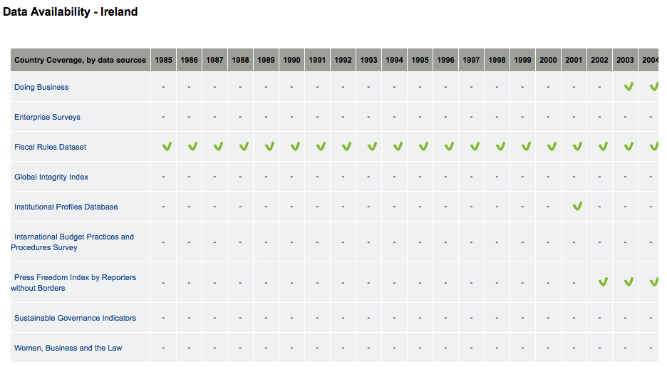
This is an interactive map depicting the World Bank’s Global Integrity Index, which is one of its Actionable Governance Indicators (AGIs). AGIs “focus on specific and narrowly-defined aspects of governance, rather than broad dimensions. These indicators are clearly defined, providing information on the discrete elements of governance reforms, often capturing data on the “missing middle” in the outcome chain”. The map allows users to select from a drop down menu which includes a subset of AGI indicator – the portal contains thousands. The interactive and downloadable map aims to graphically demonstrate the progress of governance reform worldwide. The map is but a small picture of what the Portal contains and below is a Governance At A Glance country report for Ireland.
And here is a data availability table, also for Ireland.
5. The Open Government Partnership Participating Countries map
The interactive map depicts the countries that have signed onto the Open Government Partnership and in which cohort they belong. Users can select their country of choice which hyperlinks to that country’s membership status and its progress to date in meeting the criteria for membership, where it ranks in terms of commitment and links to related documents such as action plans and progress reports. It is interesting to note, that the Independent Review Mechanism reports are not included in this list. Canada’s IRM report was submitted in 2014.
6. The Open Data Barometer Data Map
The Open Data Barometer map depicts the 77 countries the Open Data Institute has evaluated. This map assesses how open data policies are implemented in these countries according to three main indicators:
- Readiness of:
- government,
- citizens and civil society and
- entrepreneurs and business,
- Implementation based on the availability a variety of datasets within the following sub-categories:
- accountability
- social policy
- Innovation
- The following Emerging Impacts :
- Political
- Social
- Economic
These are also graphically depicted in a radar chart, as well as a bubble chart where the size of the bubble represents the availability of the datasets per category and if these sets meet the Open Definition Criteria. The data and associated methodologies are explained in the website about the report.
7. Open Contracting Implementation and Supporting Tools Map
This is a static map depicting where Open Contracting Support and Tools are implemented. Sadly, the 5 indicators depicted on the map were not explained or described. I would have to contact them at a later time to find out!
8. Reporters Without Borders World Press Freedom Index Map
This map is depicting the findings of the World Freedom Index Report for 2014, with a particular focus on how countries rose and fell from the previous year. 180 Countries are scored against the following criteria which are based partly on a questionnaire, violence committed against journalists the algorithm of which is clearly defined in the PDF copy of the report. Data and the report are fully downloadable, and more detailed maps with a legend are provided in the report itself and a methodology report.
- Pluralism
- Media independance
- Environment and self-censorship
- Legislative framework
- Transparency
- Infrastructure
9. Politics for People Not Profit Map
This is an interactive map that depicts the pledges made by nationally elected political officials to the European Parliament and asking them to commit to “stand-up for citizens and democracy against the excessive lobbying influence of banks and big business in the EU?” Mousing over a country triggers a pop-up menu which lists which party has made a commitment, while clicking on the map directs users to the page below which is a tool whereby citizens can fill in a form letter and have it sent to their elected officials to solicit them to pledge.
10. The OGP Civil Society Hub Map
This is a partially curated and partially crowsourced map on the OGP Civil Society Hub Website. The starred drops represent countries that are official OGP members, while the red drops represent any number of civil society organizations that have in some way engaged with the OGP, some of which are transnational while others are national or sub-national entities. Once a location is selected, a pop-up menu appears that includes a national flag, a link to that nation state’s official OGP member site, and provides users with the option to pick from who is involved, a selection of topic areas or a list of information resources. The map is a means to find people and activities and also a means by which to have people self identify and be recognized as civil society actors but also to connect people.
Unfortunately, the very popular and often discussed Open Knowledge Foundation Open Data Index, the Open Corporate Data indices and the Open Data Study by the Open Society Foundation have not been mapped, even though the latter includes quite a lovely world map on the cover of its report.


